The main objective of this post was just to write about my typical workflow and views. The structure of this data is also outside my immediate domain so I thought it’d be fun to write up a small diary working with the data.
Before we dive in, here are a couple of interesting reads from the Spotify blog. This article is a good read on deep learning and collaborative filtering at Spotify. This article is an interesting one about the ML pipeline that’s geared towards the problems Spotify faces. Finally, this article shows one of Spotify’s data discovery systems.
Data Management & Platform
The data that I’m using is the Spotify Streaming Sessions Dataset.
I’m running an Ubuntu Server (18.04) on a PC that I built two years ago. It’s got 12g of RAM and around 30g of space that I can dedicate to this project on an SSD. At the moment, the file systems I’m using are ext4 and exfat (I’ve heard about using OpenZFS for postgres and the Hadoop HDFS but haven’t used these). If this was for production, I’d think a lot more about data redundancy, etc.
The data is around 50GB and sits as a collection of CSV files in a tar.gz. Initially, I considered using a postgres database and I copied over two CSVs (using R’s DBI::dbWriteTable), but the table size (as seen in /var/lib/postgresql/12/main/base/) was larger than the CSV, so I’d go way over budget in terms of storage if I were to use postgres as is.
Instead, I opted for Spark. Spark/Sparklyr (an R API for Spark) supports lazy-reading of compressed CSVs and commands are optimized even when working on a single node. If I use tensorflow/keras for this project, I’ll be able to write a generator using pandas for batch processing, so this setup should be sufficient for exploration and modeling (Spark also supports GLMs and some other stats/ML models).
Memory issues shouldn’t be a problem as long as queries are written in a smart way - that said I’ll still use a sample of the sessions data (around 2% of it) for exploration because it’s just easier to work with. I also had to get the right version of the Java SDK working before Spark worked out. I’ll use Spark and the full data later after exploration.
(Click to Expand) R Code for Data Check
library(sparklyr)
library(dplyr)

config = spark_config()
config$`sparklyr.shell.driver-memory` <- '15G'
config$spark.executor.memory <- '15G'
config$spark.memory.fraction <- 0.9

data_path = '/media/training_set/zipped/'
java_path = '/usr/lib/jvm/java-8-openjdk-amd64/'
spark_path = '/home/aditya/spark/spark-2.4.3-bin-hadoop2.7/'

Sys.setenv(JAVA_HOME = java_path)

sc = spark_connect(master = 'local', spark_home = spark_path)
data = spark_read_csv(sc, path = data_path, memory = F)

skips_by_song = data %>%
	group_by(track_id_clean, not_skipped) %>%
	summarize(count = n()) %>%
	collect()
I’ll also detail some bash commands that I normally use. Commands that I used in this section:
ssh -Y aditya@local_ip: SSH with X11 forwardingpsql: PostgreSQL Terminalsudo (-u): To establish dominance (as another user)sudo mount /dev/sda7 /media: Mount external SSD to/mediasudo fdisk -l: Disk informationls -lha: List all, in a human friendly waycd -: Go back to previous directoryapropos: Help with command, list of similar commandssudo chmod -R 777 media/: CAUTION advised, make all files read/write-able by everyonetar -xvfandtar -tvf file.tar.gz > file_list: Extract file, list files in tar archivefind ~ -maxdepth 5 -name x*: Find file containing ‘x’ in~
Initial Exploration
The tracks dataframe contains an id, duration, release year, popularity estimate, auditory features (e.g. acousticness, danceability) and some kind of latent representation (acoustic_vector). All these are numeric.
The sessions dataframe is described in the dataset paper so I won’t repeat it here, but it’s basically a bunch of sessions with multiple tracks with information about whether or not they were skipped.
Read data
library(ggplot2)
library(magrittr)
library(data.table)

tracks <- dir('track_features', full.names = T) %>%
	lapply(fread) %>% rbindlist

sessions <- dir('training_set', full.names = T) %>%
	lapply(fread) %>% rbindlist

setnames(sessions, 'track_id_clean', 'track_id')
sessions[, date := as.Date(date)]
sessions <- merge(sessions, tracks, all.x = T, by = 'track_id')
Below, I’ve rounded track duration and plotted average acousticness scores by track duration.
Example scatterplot code
plot_frame <- tracks[, .(mean_acousticness = mean(acousticness)),
					 by = .(duration = round(duration * 2)/2)]

p <- ggplot(plot_frame)
p <- p + aes(x = duration, y = mean_acousticness)
p <- p + geom_point(alpha = 0.1)
p <- p + xlim(NA, 1000)
p <- p + ylim(0.25, 0.75)
p <- p + labs(x = 'Duration', y = 'Mean Acousticness')
p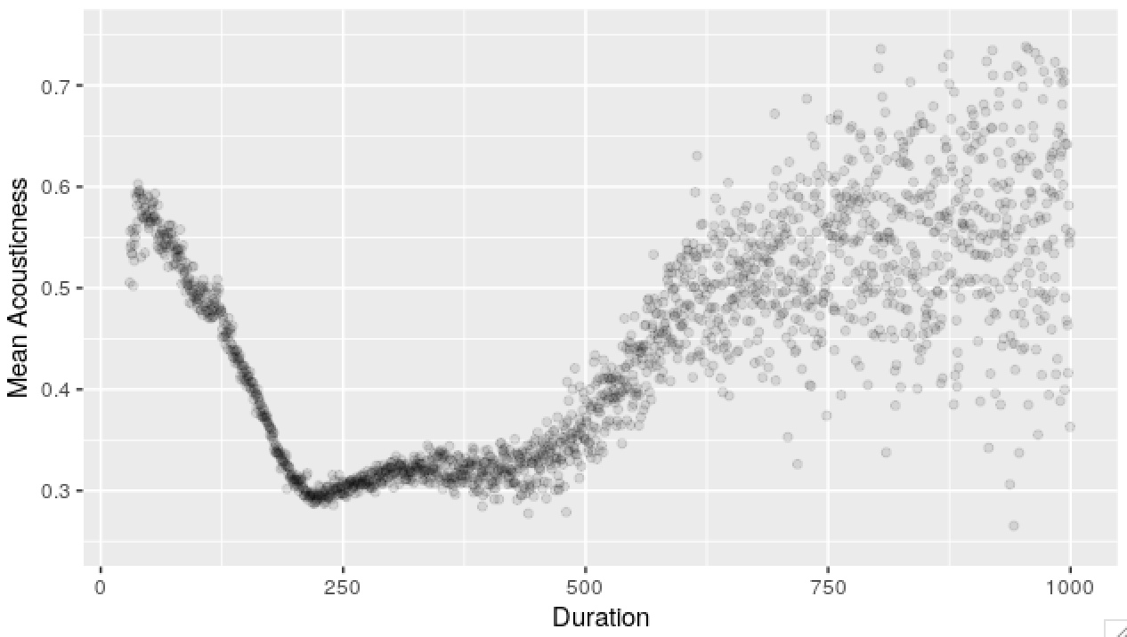
Most plots I normally look at are scatterplots, histograms, autocorrelation estimates and spectra. Filtering, group-bys and aggregating usually gets you a long way to understanding distributions, conditional distributions and first and second order effects (mean dependencies and correlations).
Sidecomment
A note about scatterplots because I love them so much. Typically, the kind of effect I’m looking for on a scatterplot is a graph dependence that looks like \(T \rightarrow X\) (2D) or \(X \rightarrow Z \leftarrow Y\) (3D).
What this means is that, I’m looking for the effect of one variable (like time, age - something that’s usually given) on another. As an example, this can leads us to see what the function \(t \rightarrow E(X(t))\) may possibly look like.
A graph based on data is like an estimator - there’s an underlying function that you want to discover and you see a lot of noise on top of this. In the example above - we see mean acoustic scores by duration. For longer durations, there’s fewer data points, so we see heteroskedasticity. The underlying function though, it’s makes sense for it to be continuous (maybe even smooth).
In the plot above, we’ve got many independent observations for both variables.
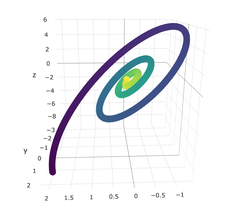
Graphs of \((X(t), Y(t))\) can be quite uninterpretable, although there are times where these are super helpful. Below is an example of a plot I made (using plotly, colored by time) with the LANL data (I can’t remember what the rv.s were, but it was something like \((X, \frac{\Delta X}{\Delta t}, \frac{\Delta^2 X}{\Delta t^2}\)). You can clearly see a very interesting relationship - one that may be well described by the dynamical equations of this process.
Below, is a list of histograms corresponding to variables in the tracks dataframe.
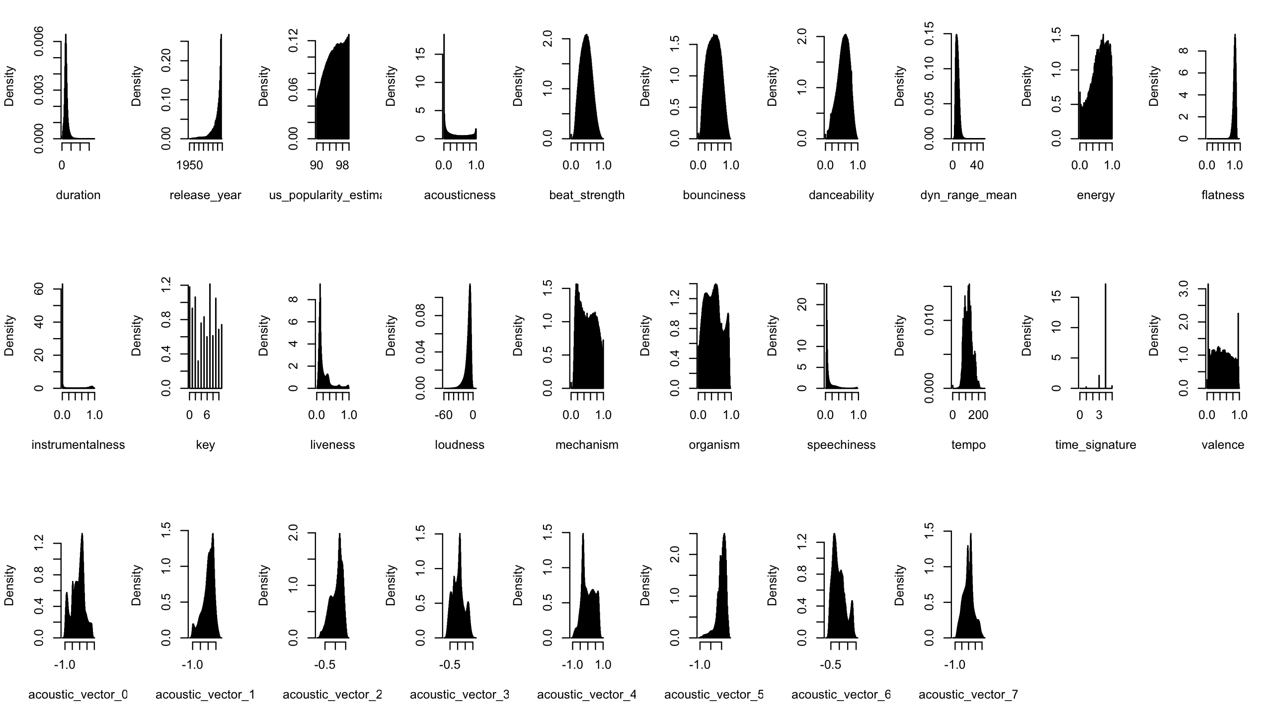
An interesting thing about this data is that we’ve got four million independent observations of a bunch of acoustic features of different songs. Given the independence, we can try to figure out the graph (CPDAG) that might be behind the variables.
I used an R implementation of the PC algorithm to work out a possible graph that might’ve generated this data. There is an assumption here about multivariate normality, so I log-transformed some of the fatter-tailed variables before working out the correlation matrix. I used a networkD3 script from here to make a nice viz of the CPDAG although it really needs to be refined.
PC alg code for CPDAG
library(pcalg)
library(igraph)
library(networkD3)

track_samples = copy(tracks)
track_samples[, track_id := NULL]
track_samples[, mode := NULL]
track_samples[, duration := log(duration + 1e-10)]
track_samples[, release_year := log(release_year + 1e-10)]
track_samples[, acousticness := log(acousticness + 1e-10)]
track_samples[, dyn_range_mean := log(dyn_range_mean + 1e-10)]
track_samples[, flatness := log(flatness + 1e-10)]
track_samples[, instrumentalness := log(instrumentalness + 1e-10)]
track_samples[, liveness := log(liveness + 1e-10)]
track_samples[, speechiness := log(speechiness + 1e-10)]
node_names = colnames(track_samples)
correl_mat = cor(track_samples)

graph = pc(suffStat = list(C = correl_mat, n = nrow(track_samples)),
		   indepTest = gaussCItest, alpha=1e-10, labels = node_names)

adjm = wgtMatrix(getGraph(graph), transpose = FALSE)
gD = igraph:::graph.adjacency(adjm)
There are ton of interesting insights here, I won’t go into them, but as an example, acousticness is a parent to dyn_range_mean, energy, organism, acoustic_vector_1, acoustic_vector_3 and acoustic_vector_7, but depends on nothing. It’s quite weird that duration is a parent of release_year though!
There are a bunch of nonlinearities in the relationships between these variables and not everything is gaussian (most variables aren’t) so this graph is approximate, but is interesting nonetheless.
Now, we move onto the sessions data.
Sessions exploration code
unique_sessions <- sessions[, unique(session_id)]
popular_songs <- sessions[, .N, by = track_id][order(-N)]
popular_songs <- popular_songs[1:10000, track_id]
# acoustic_songs <- tracks[track_id %in% popular_songs][order(-acousticness), track_id]
#################################################
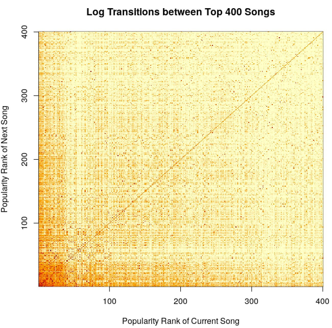
# Transitions between songs
# had memory issues here, garbage collection - gc() was used often
trans_mat <- copy(sessions[track_id %in% popular_songs,
.(session_id, session_position, track_id)])
setorder(trans_mat, 'session_id', 'session_position')
trans_mat[, pos_next := shift(session_position, type = 'lead'), by = session_id]
trans_mat[, track_next := shift(track_id, type = 'lead'), by = session_id]
trans_mat <- trans_mat[pos_next - session_position == 1,
.(track_id = factor(track_id, levels = popular_songs, ordered = T),
track_next = factor(track_next, levels = popular_songs, ordered = T)
)]
trans_mat <- as.matrix(trans_mat[, table(track_id, track_next)])
dimnames(trans_mat) <- NULL
num_songs <- 50
image(x = 1:num_songs, y = 1:num_songs, log(trans_mat[1:num_songs, 1:num_songs] + 1),
xlab = 'Popularity Rank of Current Song', ylab = 'Popularity Rank of Next Song',
main = 'Log Transitions between Top 400 Songs')
#################################################
# Seasonality
library(lubridate)
plot_frame <- function(variable) {
var <- substitute(variable)
return(sessions[, .(p = mean(not_skipped)),
by = eval(var)][order(var)])
}
plots <- list()
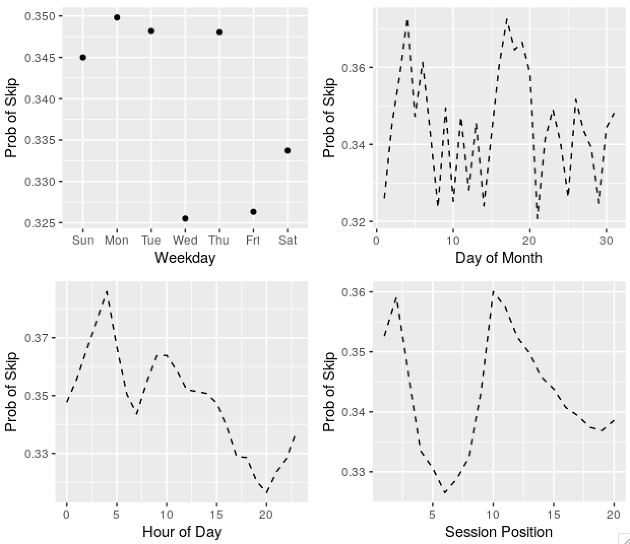
plots[[1]] <- ggplot(plot_frame(wday(date, T))) +
geom_point(aes(x = var, y = p)) +
labs(x = 'Weekday', y = 'Prob of Skip')
plots[[2]] <- ggplot(plot_frame(mday(date))) +
geom_line(aes(x = var, y = p), linetype = 2) +
labs(x = 'Day of Month', y = 'Prob of Skip')
plots[[3]] <- ggplot(plot_frame(hour_of_day)) +
geom_line(aes(x = var, y = p), linetype = 2) +
labs(x = 'Hour of Day', y = 'Prob of Skip')
plots[[4]] <- ggplot(plot_frame(session_position)) +
geom_line(aes(x = var, y = p), linetype = 2) +
labs(x = 'Session Position', y = 'Prob of Skip')
gridExtra::grid.arrange(grobs = plots, nrow = 2)
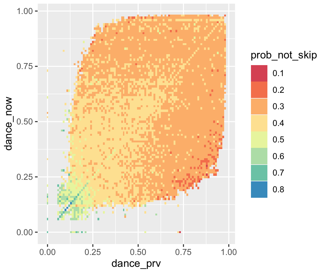
# Memory in Chains
trans_df <- copy(sessions[, .(session_id, session_position, danceability, not_skipped)])
setorder(trans_df, 'session_id', 'session_position')
trans_df[, session_position := NULL]
trans_df[, dance_prv := shift(danceability, type = 'lag'), by = session_id]
trans_df <- trans_df[!is.na(dance_prv)]
trans_df <- trans_df[, .(p = mean(not_skipped), .N),
by = .(dance_prv = round(dance_prv, 2), dance_now = round(danceability, 2))]
plotly::plot_ly(trans_df[N > 100],
x = ~dance_prv, y = ~dance_now, z = ~log(prob_not_skip),
marker = list(size = 1, color = 'purple'))
p <- ggplot(trans_df[N > 100, .(dance_prv, dance_now,
prob_not_skip = as.factor(round(prob_not_skip, 1)))])
p <- p + aes(x = dance_prv, y = dance_now)
p <- p + geom_tile(aes(fill = prob_not_skip))
p <- p + scale_fill_brewer(palette = 'Spectral')
pWe see that there are cut offs at round popularity figures, so perhaps a lot of transitions are happening due to Top 50 or similar lists. More popular songs seem to transition between themselves. There are also some interesting checkerboard-type patterns, where perhaps some songs feed between themselves a lot, maybe due to being similar in some way. There’s also the obvious mass along the diagonal - lots of songs play repeatedly. Making the same plot by acousticness doesn’t reveal anything very interesting.
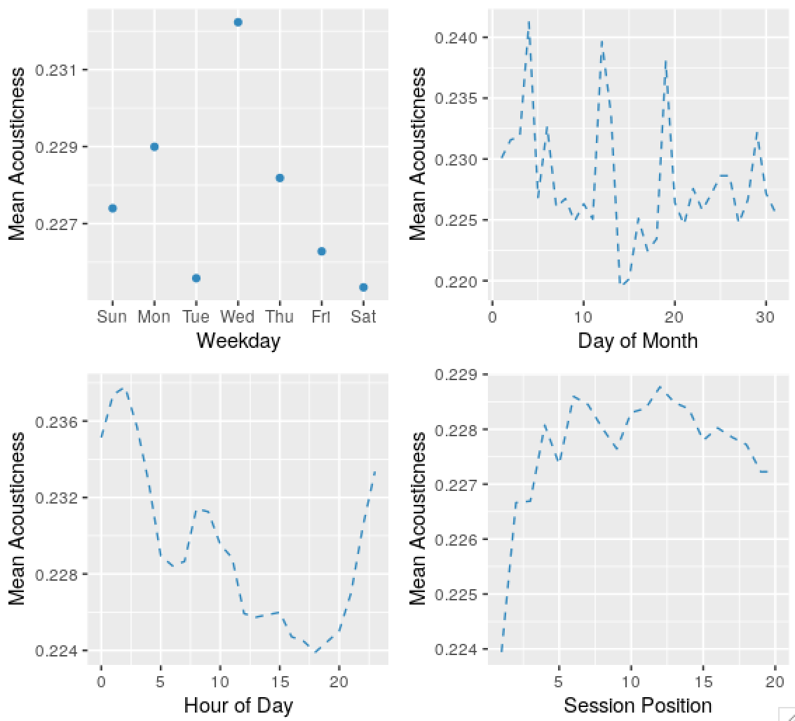
Predictably, there’s seasonality in the skip series, and the acousticness of tracks played, and other variables. Some dates are weird and obviously wrong, I’ll ignore these in the future. The autocorrelation in the probability of skips by day of month series might be an apparent effect due to weekday and time of day effects.
Click here for a 3D plot demonstrating memory in the listening chains. This clearly shows a positive association between danceability of the current song and the preferred danceability of the next song. Furthermore, if the danceability of the current song is low, a low danceability is highly preferred in the next song, which makes sense. If the plot is too big, here’s a heatmap that achieves the same effect:
2021
Efficient Gaussian Process Computation
Using einsum for vectorizing matrix ops
Gaussian Processes in MGCV
I lay out the canonical GP interpretation of MGCV’s GAM parameters here. Prof. Wood updated the package with stationary GP smooths after a request. Running through the predict.gam source code in a debugger, the computation of predictions appears to be as follows:
Short Side Projects
Snowflake GP
Photogrammetry
I wanted to see how easy it was to do photogrammetry (create 3d models using photos) using PyTorch3D by Facebook AI Research.
Dead Code & Syntax Trees
This post was motivated by some R code that I came across (over a thousand lines of it) with a bunch of if-statements that were never called. I wanted an automatic way to get a minimal reproducing example of a test from this file. While reading about how to do this, I came across Dead Code Elimination, which kills unused and unreachable code and variables as an example.
2020
Astrophotography
I used to do a fair bit of astrophotography in university - it’s harder to find good skies now living in the city. Here are some of my old pictures. I’ve kept making rookie mistakes (too much ISO, not much exposure time, using a slow lens, bad stacking, …), for that I apologize!
Probabilistic PCA
I’ve been reading about PPCA, and this post summarizes my understanding of it. I took a lot of this from Pattern Recognition and Machine Learning by Bishop.
Spotify Data Exploration
The main objective of this post was just to write about my typical workflow and views. The structure of this data is also outside my immediate domain so I thought it’d be fun to write up a small diary working with the data.
Random Stuff
For dealing with road/city networks, refer to Geoff Boeing’s blog and his amazing python package OSMnx. Go to Shapely for manipulation of line segments and other objects in python, networkx for networks in python and igraph for networks in R.
Morphing with GPs
The main aim here was to morph space inside a square but such that the transformation preserves some kind of ordering of the points. I wanted to use it to generate some random graphs on a flat surface and introduce spatial deformation to make the graphs more interesting.
SEIR Models
The model is described on the Compartmental Models Wikipedia Page.
Speech Synthesis
The initial aim here was to model speech samples as realizations of a Gaussian process with some appropriate covariance function, by conditioning on the spectrogram. I fit a spectral mixture kernel to segments of audio data and concatenated the segments to obtain the full waveform.
Sparse Gaussian Process Example
Minimal Working Example
2019
An Ising-Like Model
… using Stan & HMC
Stochastic Bernoulli Probabilities
Consider: